Searching for Light

Logo - Teal.png

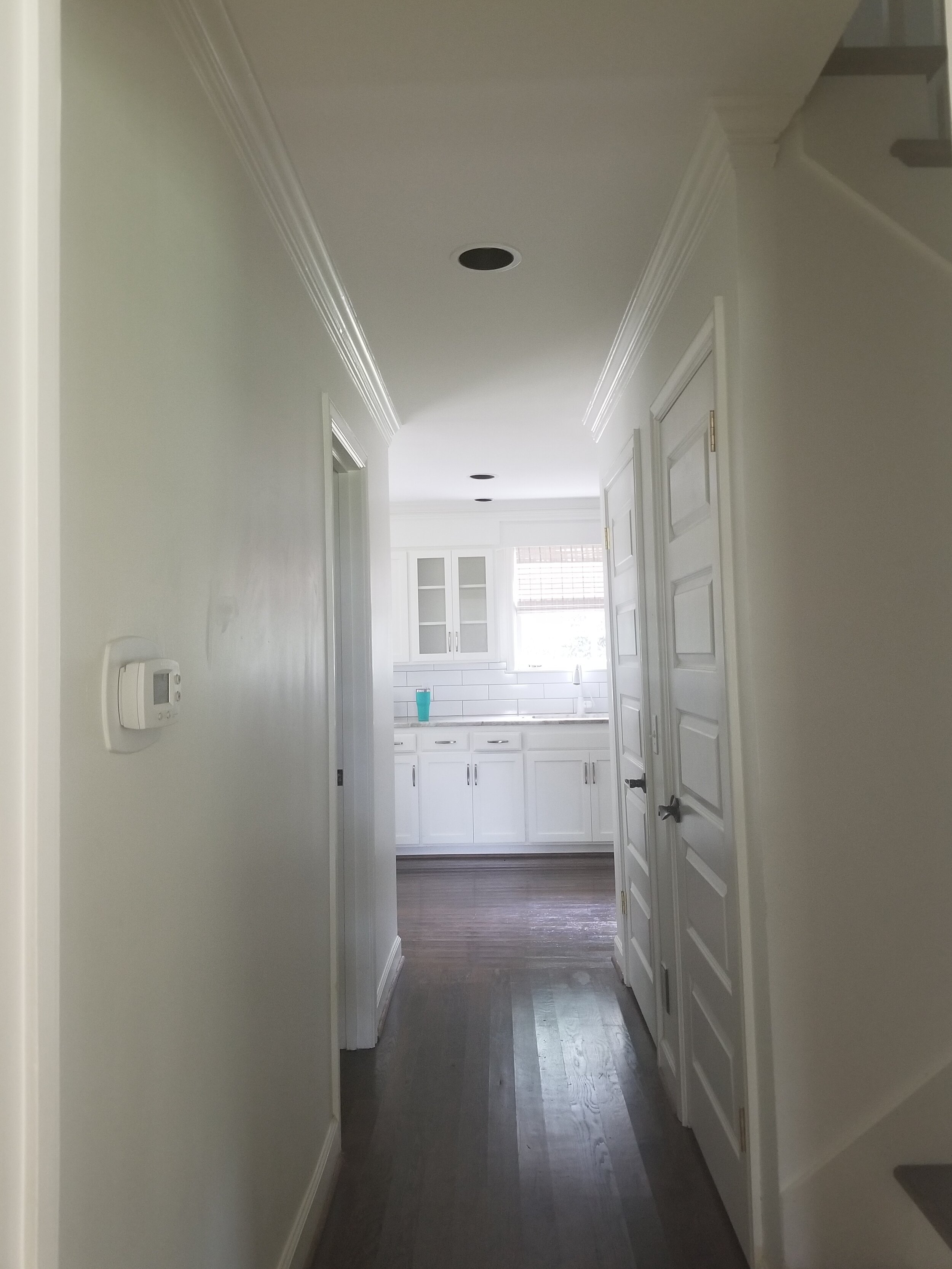
Focusing on light this month has made us take notice of not only artificial light but natural light and the way we’ve made changes when artificial light just wasn’t enough. In this project, we had a client who had found the perfect house, well almost. The location was exactly where they wanted to be, with just the right amount of land and in the right neighborhood for their children. However, parts of the home felt closed off, dated and too dark for their liking. So, we tore down some walls and updated the space. We hope you love the final result!

1568234455422-8PHEE99WKMF4OLZ3A6XM.jpeg

BEFORE…

20180905_151242.jpg
20180905_151313.jpg

Our client loved the location of this home but couldn’t stand the small kitchen. One, it wasn’t a central part of the home and felt much too closed off from the rest of the house. The lack of space and lack of layered lighting made the face feel cramped. So, we opened the kitchen and placed it to more of the center. We added architectural details, natural elements, replaced all cabinetry, and installed new lighting.

DSC_0085.JPG

BEFORE…

1568234627505-WA5QG82WDRAUOP97F3LK.jpeg
Look at how low these ceilings once were!

Look at how low these ceilings once were!

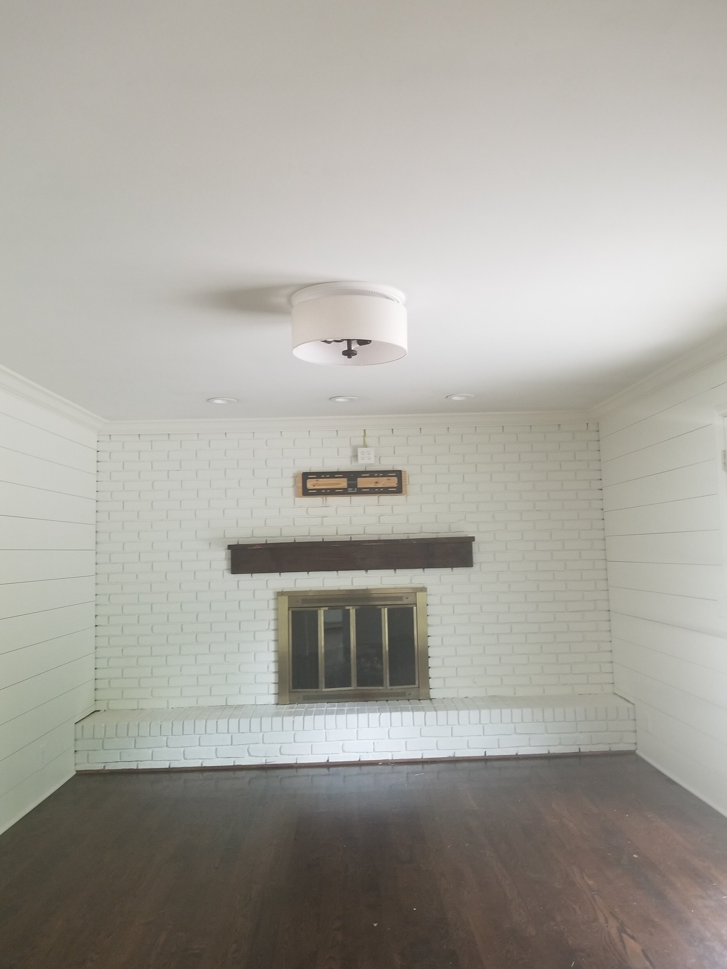
With the perfect location and a house under budget, our client decided on some big renovations to make this their dream home. We worked with a trusted architect to increase the ceiling height and change the exterior of the home. We then added some large windows to bring in light to an otherwise dark space, increased the fireplace height along with cream colored bookcases. This one change brought in ample lighting that filtered into the rest of the home, and we finally had a bright and open concept.


Want to see more of this space? We love the bright blue accents and natural elements in this space. Check it out!


Natural lighting when buying a home is so important. But as you can see, anything can be changed. If you have everything checked off the list but want to change something, remember that you can! We’re here to help!
— Paige W. Design Team

March's Design Accent

Screen Shot 2020-02-05 at 12.38.50 PM.png

Lighting is the biggest difference you can make in a space! Thats why this month were focusing on LIGHT! Light can transform the mood and functionality of a room and it is a master manipulator on the illusion of space. Its a culprit in making design tricky but it is beyond rewarding when you get it just right!

Different types of light

When designing, it’s important to use multiple types of lighting. By giving the client layers of light, this allows them to control the mood and functionality of what they need throughout the day. A few of these layers are: general, task and decorative.

General lighting

Photo Nov 14, 1 31 34 PM.jpg

General lighting covers overhead and recessed lights. This includes chandeliers, large pendants, canned lights, etc. This is an important base of lighting, that should not be skipped.

We can’t wait to show you the rest of this project! But until then, we can tell you that this was the very first piece picked and it helped curate the rest of the home.

This is the perfect example where general lighting can be an art piece in itself!


14.jpg

Task Lighting

Task Lighting covers forms of more direct light. Such as desk lamps, under-cabinet lights, or directional floor lamps. Perfect for reading after the sun goes down. Once you live with this ambient light, you won’t ever want to live without it.

Does this picture look familiar? We worked hard to make this custom bookcase come to life! We think it turned out beautifully, check it out if you want to see the rest of the home!

Decorative Lighting

Decorative lighting is the cherry on top. This could include lighting that glows underneath a cabinet, or recessed lighting in bookshelves. This type of lighting is fun to play with and shows that you went the extra step.

Isn’t this the perfect spot to cozy up to on a rainy day? We designed this custom bookcase to help balance out the space and add some extra color. See how pretty the light reflects off the metallic wallpaper? We love it!

Photo Jan 23, 12 32 40 PM.jpg

We’ve talked about all the details on picking out the perfect lamp! Do you remember? Check it out!


Thanks for checking in with us! We are so looking forward to showing you more projects this month. Talk soon!
— Paige W. Design Team

Stair Runners and Why We Love Them

Logo - Teal.png

We don't just use stripes in picture frames and fabrics, we use them on the floor too! We wanted to show off some beautiful examples of the way we’ve used stripes. It’s a great way to add color and pattern to an otherwise bland space.

Why a stair runner?

Photo_Sep_19,_9_52_57_AM.jpg

It could be for many reasons! In one instance, you may want to protect the wooden stairs. Maybe the stairs are brand new and you want to protect their finish or they’re a bit damaged and you want to cover them up and give the space a refresh!

In one of our client’s homes, we installed a stair runner for safety reasons. She has an elderly dog who had trouble with traction on the stairs and was unable to use them! Installing a stair runner added traction and safety for their little dog who needed some extra help!

what material to choose?

Durability is important with heavy trafficked areas. We typically specify custom stair runners with a wool blend.

We look for a loop-pile construction since it is a tighter weave and won’t show the traffic pattern!

Stripes are perfect for stairs because of their movement and pattern. They help hide the wear and tear.

Check out Annie Selkie’s line of indoor/outdoor carpets. Paige fell in love with this one for her entry stairs.

Photo_Dec_22,_7_35_30_PM copy.jpg

Go look at our last blog post on stripes, if you missed it earlier this month!


Do you have some stairs that could use some refreshing? Stair runners are an elegant way to make a space feel new!
— Paige Williams Interior Design

May's Design Accent

Screen Shot 2020-02-13 at 2.13.47 PM copy.png

Who knew Paige’s secret talent were flowers!? This month we’re focusing on everything FLORAL! Did you know Paige has been designing floral arrangements for over 15 years with The English Garden, a boutique floral shop in Belle Meade? She has a lot of knowledge on flowers and its led to some really beautiful installs we’ve had!

In every install we do, Paige always makes sure we include beautiful flowers! They breathe life into a space and bring so much happiness to the ending of a well-done project.

Paige_Williams_03.2018-48.jpg
vernaglia_install_2.jpg

If you want to see the finished picture of this design, look here. We’re really proud of how it all turned out so beautifully!


And of course, we wanted to thank Terry White, owner of The English Garden, who is not only beyond talented but a wonderful friend to Paige! Check out all of his amazing designs, they are breathtaking!


This is the perfect time to stop and smell the flowers. We’re trying to appreciate the small things this month!
— Paige W. Design Team

February’s Design Accent

February.png

We love bold and colorful patterns! This month, we’re focusing on the many different ways we use STRIPES! Stripes add movement to a space, which can either be playful or a bit more classic depending on the color and repetition of the stripe.

Where did stripes come from?

They first appeared in medieval times to segregate prisoners and delinquents from common people. They again showed up in the 1920’s in women’s fashion—most notably activewear and working clothes, as a sign of rebellion during the women’s suffrage movement. In the 1940’s, pin stripes became popular in men’s clothing, largely due to the mobsters of the time making it their “uniform”. Honoring both past and present, stripes are definitely a societal disturbance.

How do we use stripes?

This month, we’re going to be featuring some of the different ways we use stripes in our projects! But here are a couple ways we’ve loved adding some excitement to a space.

house-54.jpg

These pillows, used in the O’More Showhouse, are made of the same fabric from the chairs above. But they have a super fun hot pink fringe!

The pattern on these chairs definitely lend themselves to the more playful side. Their stripes are more detailed with an extra pattern. However, from a distance, still read as stripes. Check out the rest of the home!

IMG_20160506_103427847.jpg

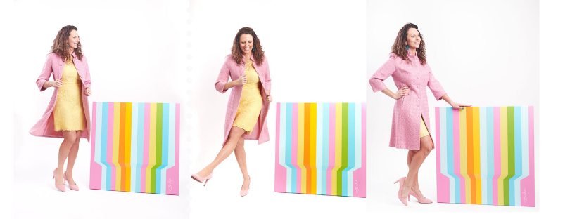
The featured art that Paige is posing with is by Gina Julian! She is an über talented artist, whom we have admired for some time. Check her out—she’s inspirational!

We’re excited to look back and see what fun projects we’ve used stripes in! Stay tuned!
— Paige Williams Interior Design Team