We have a new project to show you! And we are SO excited with how it turned out, and our wonderful clients are too!
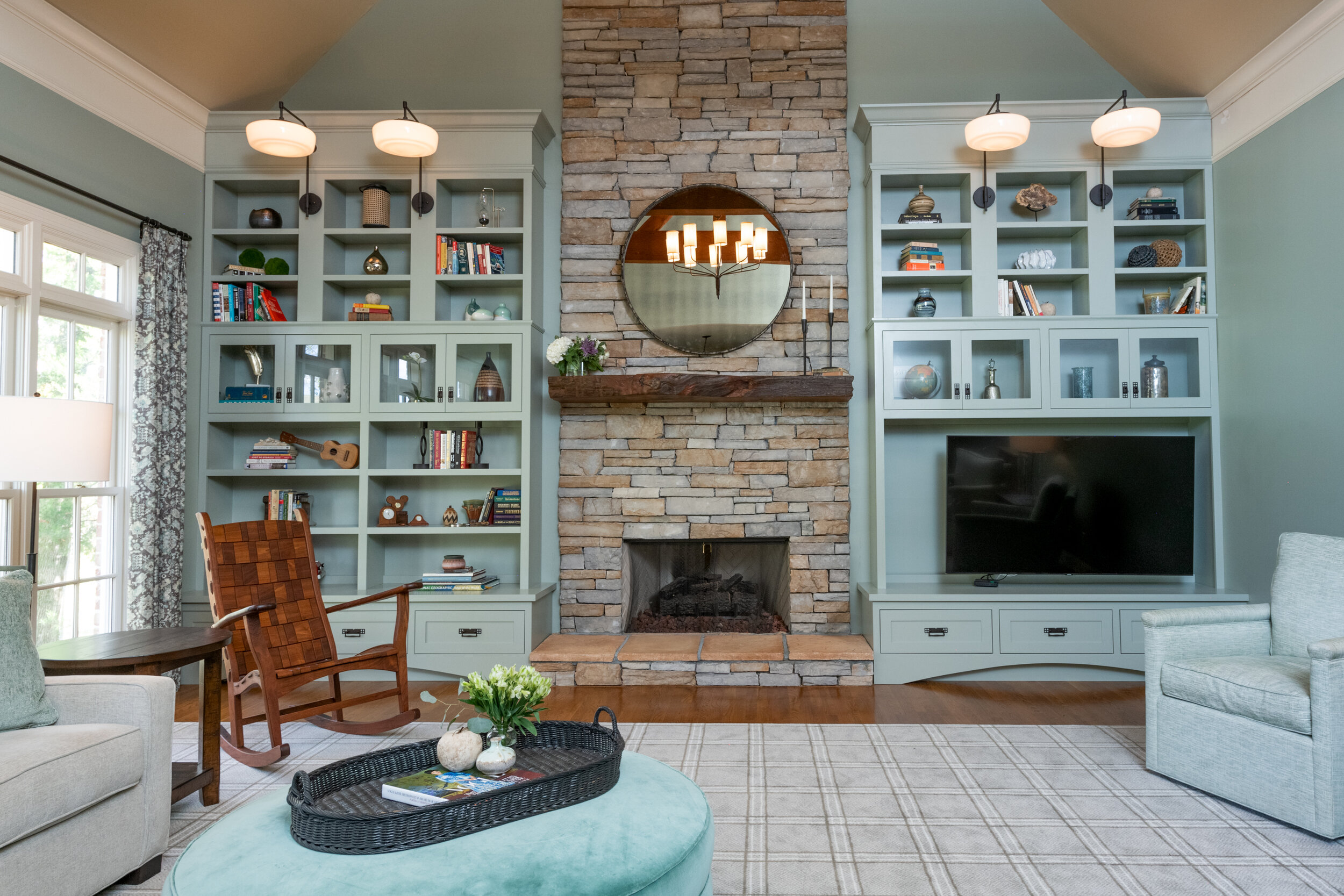
This space was incredibly expansive, but the wall wasn’t utilized and the fireplace looked bulky and out of place. With this wall being seen throughout the rest of them home, we needed to make it full-scale at every angle.
One of the main desires was comfortability for the family because its the main gathering space that opens up from the kitchen. Our clients loved soft earth tones with an emphasis on blues and greens. They wanted to display treasured books, vases and family photos. Adding bookcases made the fireplace make sense and helped ground how heavy the stone was to the once-bare room.
Can we please have more custom ottomans in 2021? Thank you!
THE BOOKCASES
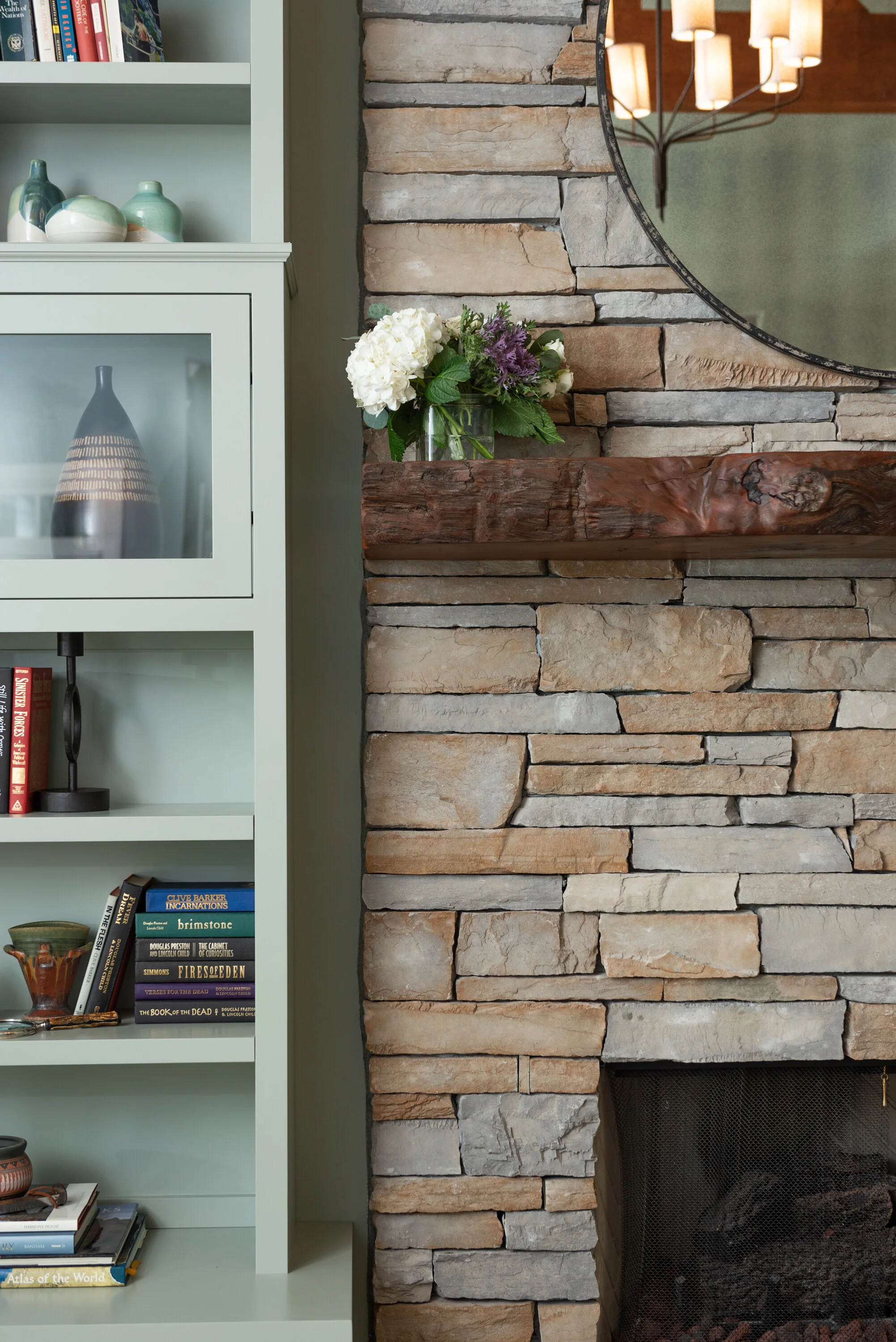
A shining star on this project was the paint we chose for this space! It’s even more beautiful in person. It’s a beautiful moody blue—green—grey!? It transitions depending on the time of day, but what we do know, is that it works! Sherwin Williams, Escape Gray, was used on both the bookcases and walls to make the entire space seamless. A designer’s note: when ceilings are so tall, it’s important to minimize the odd space above the bookcases. We do this by painting the bookcases the same color as the entirety of the wall. Try to avoid the gap above cabinets when they don’t reach the ceiling.
THE TELEVISION
The family didn’t want the television to be the main focus and with the fireplace being so tall, we wanted to take advantage of the height when designing the bookcases. These reasons validated our decision to place the television on the lower bookcase. You can’t see this in the pictures, but the television swivels out to help the flexibility and ergonomics of the space.
LIGHTING
With only two recessed lights and a ceiling fan, lighting was a main issue, even with the large windows, the room always felt too dark. You’ll hear us often say we need to “layer lighting,” refer back to one of our previous blog posts to understand what we mean by that. We replaced the ceiling fan with a beautiful chandelier, added sconces to the bookcases and placed table lamps throughout the room. This made the room well-lit but still moody, cozy and functional.
THE DETAILS
We tried to reflect the family’s love for Arts and Crafts style throughout the design. Selecting cabinet pulls, hinges and even the lighting gives a slight nod to the classic craftsman style. Luckily, our client trusted us and our vision and we think it turned out beautifully.
“We finished out this project with a small get-together, which of course included champagne and all the curious animals. ”


