Fabric: Our Design Foundation


Fabric is our design foundation. Its color, texture, and functionality is the ultimate physical manifestation of creativity. We use fabric as the core material to really connect and evolve with our clients. When designing a space, each fabric should be unique enough for its designated room so that each space feels special and full of personality. We ask our client’s to fall in love with a BOLD print or a solid color to kick off our design process.


Prints vs. Solids

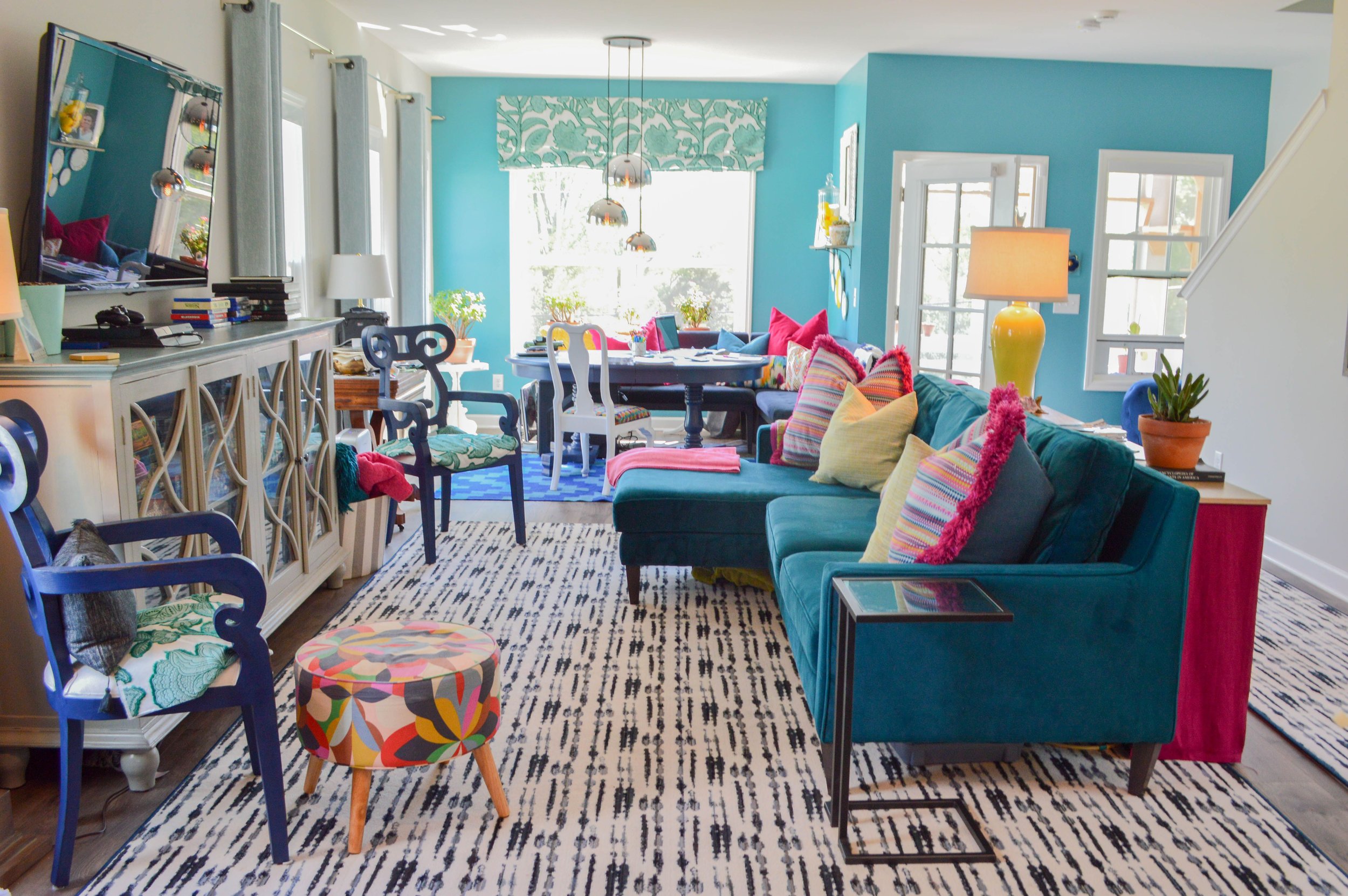
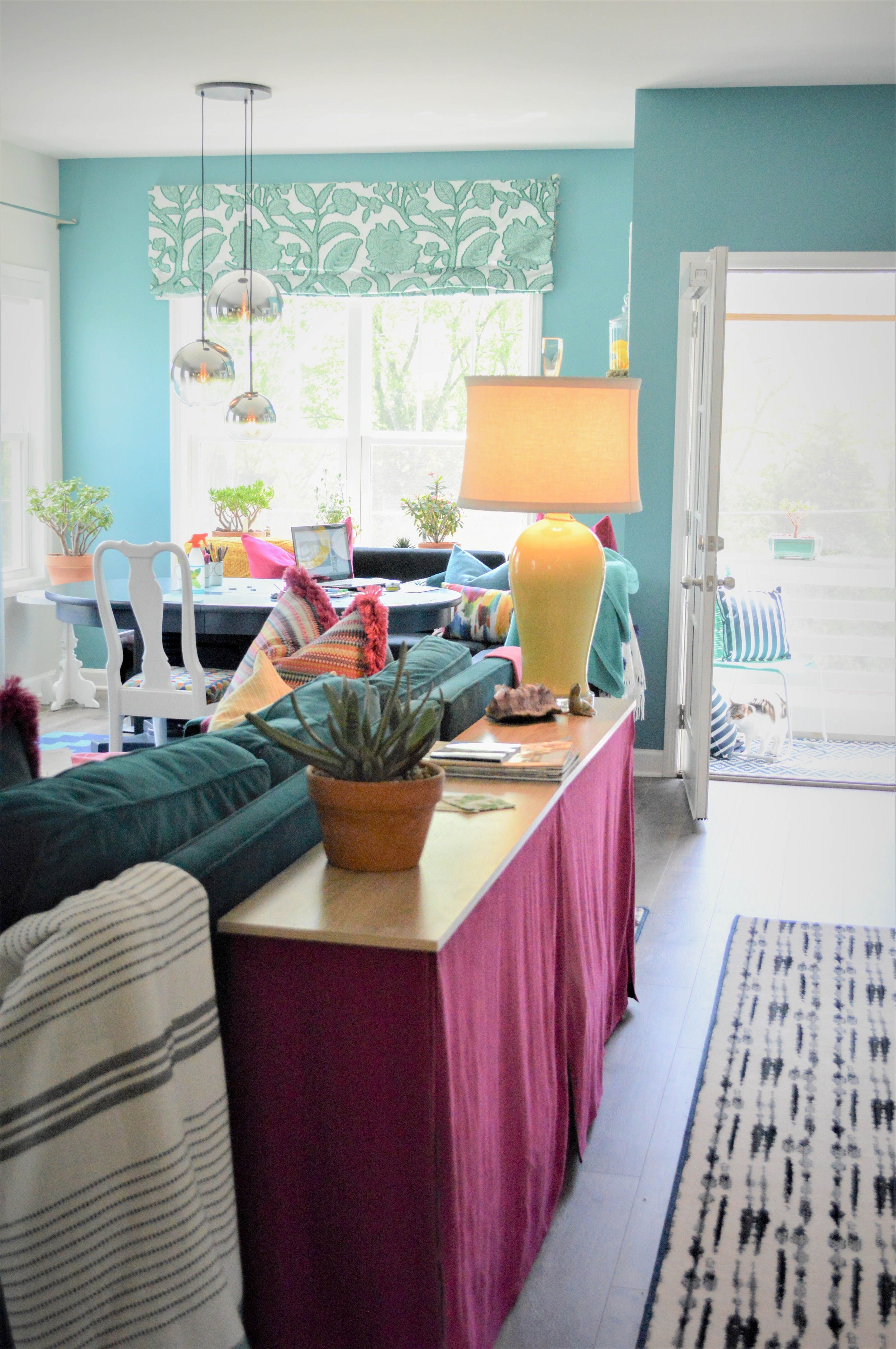
I hear all the time from client’s who are not ready to commit to a bold print because they do not know how to accent it in their home. I obviously LOVE to layer prints to create depth & interest in a space. Mixing prints and textures is my signature & I am definitely not afraid of using color. Below is how I incorporate prints and solids in my own home, but it all started from falling in love with one print!


What print inspires you the most to use in your home?

- Paige


Meet our Newest Designer

It is my pleasure to introduce our newest lead interior designer, Mattie Couser. We are so excited to have her as a part of our team and look forward to all of the creativity she brings to our team!


Mattie Couser

Mattie, a Columbia, TN native, graduated from O'More College of Design in 2010 with a Bachelor of Fine Arts in interior design. Before joining the team, she worked as an assistant for two designers in Nashville, doing sales in tile and cabinetry, and most recently with a local home builder.

Design started for her at a young age, from painting and rearranging her bedroom, to doing the same thing all the way to her college dorm room. She likes fun colors, and bold patterns, but also appreciates antiques and the value of mixing old with the new. Though she has an appreciation for all design styles, anything Frank Lloyd Wright totally captivates her heart. From the well-thought-out layouts and interiors to the use of colors and materials. Every part is so well thought out and makes for a wonderful design.

When not working, she spends her time with her husband, Daniel, helping with his own local business. Or keeping up with her son, Caden, and cat, Nelly. She enjoys staying active, helping out with her son's scouting troop, cheering on anything football, or enjoying the local art scene.


What's Your Favorite Color?


Color is a great way to change up a room. But how do you choose the perfect color for your space? Fun fact… Paige’s favorite color is YELLOW! Yellow is considered an eternal and joyous color by many. It symbolizes happiness, good energy, and warmth— as it is the color nearest to light.


What colors are you attracted to naturally?

I ask many of my clients to show me their closets. This shows me the types of colors that they wear and are therefore attracted to. If it’s in their closet, it’s more than likely going to be a color that will work for them in their home. We are all attracted to certain colors that make us happy. Below is our latest project just posted on our website! This client’s custom closet & master bedroom go hand in hand to create the ultimate master suite.


Vincent Van Gogh, an avid lover of the color yellow once said: “I dream my painting and I paint my dream.” I am so happy that I can do the same!

What’s your favorite color?

- Paige


How to Add Textures to Your Design


Tile is a practical way to add texture and visual interest to any space. But with so many shapes, colors, and sizes, a simple walk through a showroom can send even the savviest DIY-er over the edge.


Here's what to keep in mind when taking on tile

HONEYCOMB

These trendy tiles are an easy way to add flair anywhere in your bathroom, but they can be particularly useful in your shower, where the floor in sloped for drainage. Their small size easily covers the floor slope and the multitude of grout lines increases traction and reduces the risk of slips.

BEVELED SUBWAY

You know subway tile, but do you know beveled subway tile? A modern twist on the classic block creates depth and visual weight, giving your bathroom or kitchen a bright, quilted look.

CHEVRON & PENNY TILE

Everyone loves a good chevron or penny tile backsplash -- and that's where they should stay! These small-scale, intricate designs are too busy to be used on the floor. Spice up the backsplash then choose a larger, more solid tile for the floor.

12X24

As the size of the average person's bathroom has increased so have our floor tiles. 12x24 tile has become a popular floor option because of its size and pattern versatility. Line them up straight or stagger them across. It's up to you!


DSC_0088.jpeg
2.jpeg

This month, we are taking on nearly a dozen kitchen and bathroom projects so it’s safe to say we are dreaming in tile these days. The real tile trend? Cool greys and crisp whites are dominating tile color palettes by bringing an airy, fresh look to bathrooms and kitchens. What’s your next tile project?

- Paige


How to pull off a monochromatic room


Monochromatic is the Design accent for August. Just like the outfit @emilygoodinstyles selected for Paige! She layered a mixture of materials & textures in this look much like she uses when designing interiors. Such as leather, metallic wool, velvet, and painted wood all in the same color tone (and tassels - they count right?) What we call Monochromatic in the interior’s world is all about using textures and hues of the same color tone and don’t worry there will be plenty of color if we have anything to do with it!


A monochromatic room—bold, eye-catching, unabashedly intentional—is the opposite of timid. Using strong colors in this way is no different than creating an all-white room or a room using variations of beige or gray.


Layering interesting textures is an important⁣ element when designing a MONOCHROMATIC color scheme to create more interest in each room.⁣

Photo: @carolinesharpnack

This MONOCHROMATIC moody dining room is exciting to the eye since we combined different textures such as gold & mercury glass accents, subtle wool rug, cotton organic patterned curtains, and a rich velvet on the dining room chairs. Look below see the BEFORE of this dining room!

Mixing light & dark hues & paint sheens of the same color tone can also create interest when designing a MONOCHROMATIC room. We refinished our client’s existing buffet in a deep purple, high-gloss paint to sit against the eggshell finish walls in the same color tone. The buffet blends well into the room but still makes a bold statement. Look at the AFTER!!


We hope you’ve learned a few things about how to pull off a monochromatic room & you’ll consider having a monochromatic room in your house!

- Paige W. Interior Design Team