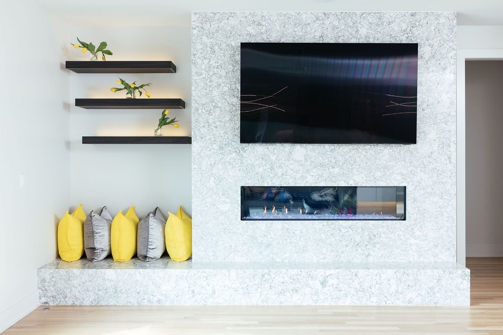
Every family is unique: some have a troop of children, others have a litter of rescue pets, many are empty nesters ready to cultivate a space for entertaining, and some have all of the above! A thoughtfully-designed home can tackle these (and other) challenges with ease, maximizing spaces to create an environment perfectly suited to fit your specific needs.
Our Modern Nashville Surprise project is the perfect example of designing with circumstance in mind, while also achieving our clients’ design goals and preferences. The existing home was a standard build, but with four children and a pup, we knew we needed to curate a space perfectly suited just for them. Here’s how we did it.
Relocating and Reimagining Existing Spaces
When approaching a remodel, it’s important to remember that rooms don’t have to keep the same function as they were originally intended. In our Modern Nashville Surprise project, we knew we needed a dedicated space to serve as a catch-all and clean up station for the kids constantly venturing in and out of the house.
We converted what was once an office into a sleek mud room to perfectly mask the chaos that comes along with kids, even designing four separate cabinets, drawers, and slots for individual laundry baskets. Plus, we added a double washer and dryer to make laundry a breeze! Behind the cabinetry, our clients can perfectly conceal things like shoes and cleaning supplies.
Simple Swaps to Add Charm
While we kept functionality in mind throughout the redesign, charm and appeal were equally as important to us and our clients. And when you’re thinking about curating an inviting home, the front door is the perfect place to start! The existing home had a traditional brick outdoor entryway with a wooden door. The home’s exterior received a coat of white paint, so we wanted the front door to really make a statement – and the result certainly does! The copper front door was created by Copper is my Canvas, and it’s a showstopper.
Maintaining Design Preferences
The name “Modern Nashville Surprise” perfectly sums up this project’s results, especially when you consider the before. The existing interior was drab and dated, and our clients wanted a look that would be bright, sleek and modern, yet timeless. The result was a stunning, cohesive transformation that perfectly blended style and function through the use of monochromatic whites and grays, marble, and chrome.
While creating spaces to accommodate growing kids was important, we also ensured the parents had a respite equally as beautiful and practical. Check out the primary bathroom and kitchen!
Ready to tackle your home redesign? We’re here to help. Schedule your consultation today.


