Breakdowns and Behind the Scenes: A Custom Bar Space

No matter the project, home renovations require an extensive amount of thoughtful planning. We’ve heard plenty of horror stories about remodels that, once complete, had left out a detail a client would’ve never considered on their own. Working with a qualified designer can help alleviate any of those concerns, as experience should help ensure no small detail is left unaddressed. 

Go behind-the-scenes of our recent custom bar space remodel, from planning through construction and, of course, the big reveal!

Planning and Construction

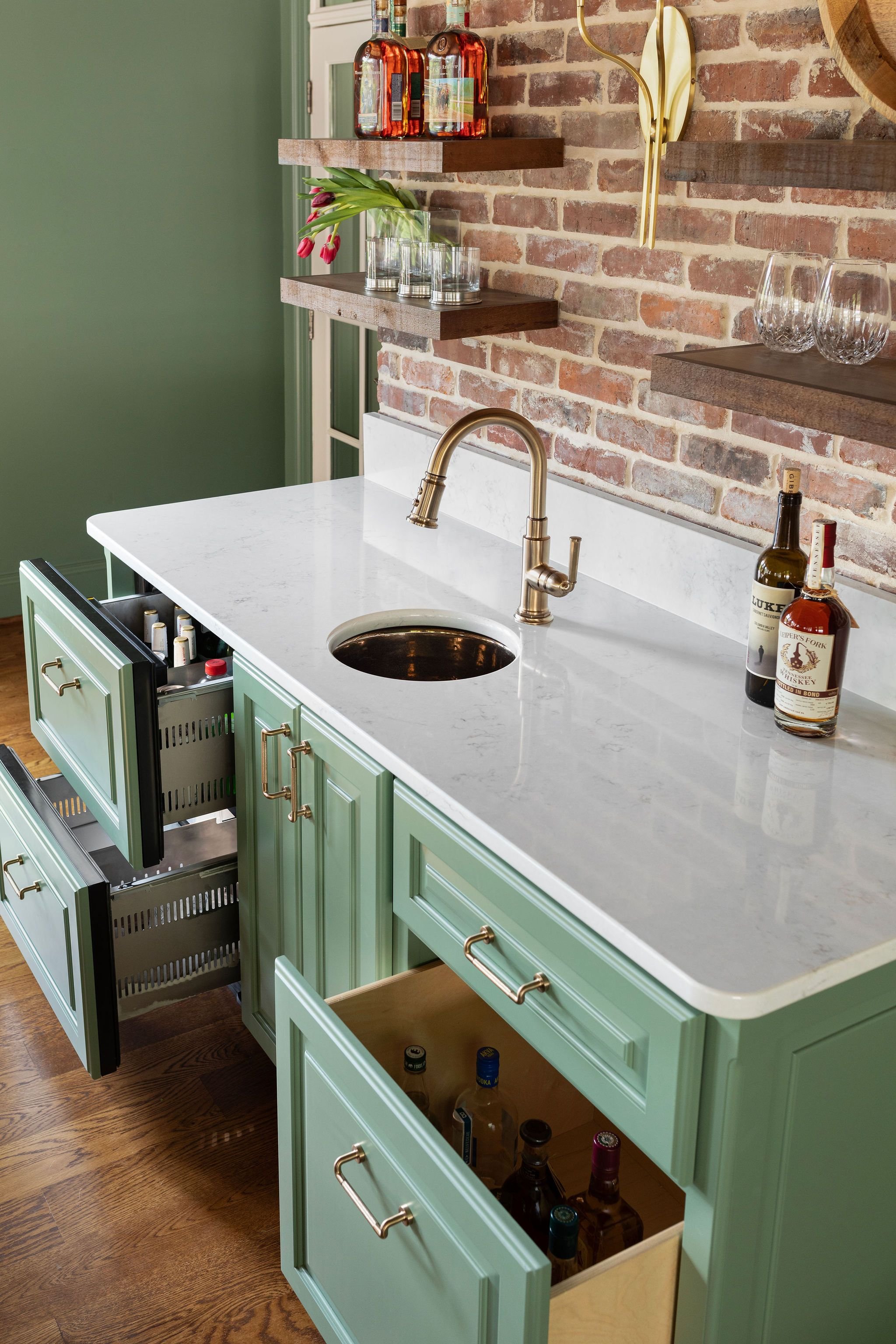
Despite this project being a relatively small space, it’s important to understand just how many moving parts play into home design. In this project, we worked around an air return, carefully planned the electrical to route through brick and center everything perfectly, added plugs into the quartz backsplash and designed around a taxidermy statement piece (a gift from Luke Bryan!). We even considered things like storage for larger liquor bottles, which we achieved through oversized, strong custom drawers.

With all of the hidden details squared away, we turned toward planning the visual elements, like custom paint colors, hardware and finishes. We opted for Brizo hardware to match the Brizo faucet finish, and added a stunning gold Rhol lacquered sink. 

Now with the design in place, it was time to begin construction. Considering our brick backdrop, precision was paramount toward achieving our goals. 

Final Result

Time for the big reveal! We were absolutely thrilled with the results of this build, from the stunning custom green working seamlessly with the existing brick, to the infinite details that made this space perfect for our clients: floating shelves to display barware and collectibles, drawers for refrigeration, ice and bar storage, a small sink for easy clean-up and a perfectly centered sconce. Towering above it all (also perfectly centered, might we add) is the family’s meaningful mounted deer. 

Coffee, Cocktails and Coolers: Customizing Your In-Home Bar

Whether you’re a coffee, cocktail or wine connoisseur, having an in-home bar area dedicated to your craft of choice is a game changer. We love taking an existing space and adapting it to a custom bar of our clients’ dreams, whether that’s transforming a pantry to a dedicated coffee nook or tacking a cooler space onto an outdoor fireplace. 

It’s safe to say, if you can dream it, we can do it. Check out how we helped create the perfect bar space in these Tennessee homes. 

Coffee

Pantries are some of the most versatile spaces in your home, and are completely customizable depending on what kitchen storage is needed for each individual family. In a recent remodel in Franklin, we converted a pantry closet to a coffee bar to keep our clients perfectly caffeinated. In doing so, we were able to create a bright space for a morning joe while also keeping storage space for lesser-used appliances. We also added a mini beverage fridge to store cans, wines and, of course, all the coffee creamers. 

As the icing on the cake (or the sugar in the coffee), we swapped the existing door with wooden barn doors to hide the space when not in use and ensured we left space for a nugget ice maker and a barista-level cappuccino machine. 

Cocktails

We’d be remiss not to mention this stunning mid-century modern masterpiece by Broken Compass Woodworking in a recent remodel. We converted an existing space in our client’s home to the ultimate entertainment center, complete with built-in seating and custom storage. The project’s focal point is the custom bar that beautifully displays our client’s collection of barware, heirlooms and pieces purchased while traveling.

When it comes to cocktail bars, we have a few tricks up our sleeves we can’t wait to debut soon. Stay tuned! 

Wine Cooler

Having an in-home wine cellar or dedicated storage space is a luxury, and we were honored to have designed a few custom spaces over the years. One in particular came about during a design meeting, when we noticed a large collection of wine inside a side table. We thought, why not create a space for entertaining centered around wine? We added a wine fridge that can hold more than 30 bottles, plus seeded glass cabinet doors with visible wine racks for those meant to be at room temperature. We added storage for barware, cocktail napkins and accessories, and a small sink for convenience. 

In a separate project, we created a completely custom space for our wine connoisseur clients leveraging their exterior brick fireplace. Formerly a screened in porch, the new addition kept the chimney, allowing us to add floating shelves, lighting and other bar-specific elements. The bar space has everything needed for entertainment, from a draws specifically for refrigeration and ice, and even one measured and weighted precisely for holding taller liquor bottles. 

Thinking about adding a dedicated bar space in your home? We’d love to help. Schedule your consultation!

How to Elevate a Guest Bathroom

Any renovation project is an undertaking, even when transforming a small space. In bathroom remodels, specifically, an equal amount of plumbing, fixtures and design decisions are required whether outfitting a grandiose primary bath or a modest guest bath. In a recent project in Franklin, we tackled remodels for both at the same time, which helped streamline the process and share resources between the two. 

We unpacked the stunning (and eccentric) primary bathroom remodel in a recent blog, but the design choices in the smaller space were just as transformative. 

Check out this bathroom redesign Q&A and deeper look into the “Break the Status Quo” project. 

Is it better to tackle projects at the same time, or stagger them? 

The choice ultimately comes down to personal preference, but we recommend bundling projects into one as opposed to separating them out. In any remodel, your home becomes a construction zone, so knocking projects out in one swoop reduces the amount of time your home will be disrupted. Plus, in many cases, there may be opportunities to share labor or materials between spaces. If a tiling or plumbing team is already there to outfit a kitchen, it can sometimes be a cost saver to tackle the bathroom at the same time. 

How can you maximize space in a small bathroom?

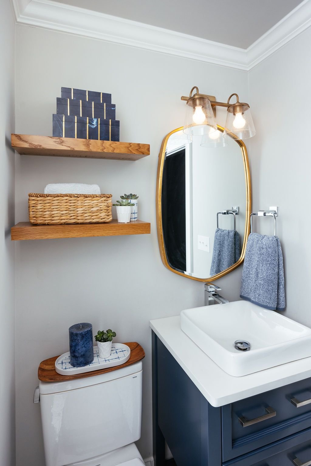
In our recent guest bath remodel, which was certainly a small space, we maximized every inch by looking up and looking in. We added floating shelving above the toilet to maximize the room’s height and create a space for attractive storage and decoration. We also selected a vanity with several drawers and shelving for additional storage.

In the shower, we created a niche wall to house and display toiletry items. By utilizing space within the drywall, we were able to leverage an area that wouldn’t otherwise be used to give guests a touch of extra room when showering. 

What can I expect from a bathroom remodel? 

All remodels are different, and we love customizing design choices and plans based on each client’s desires. But, it’s important to note that bathroom renovations big or small are intricate processes. The options are endless when it comes to rerouting plumbing and transforming the entire space, or simply opting to upgrade fixtures, flooring and paint. 

How can I incorporate color into a bathroom or powder room?

In this project, we kept neutral walls and added pops of color through the navy blue vanity, gold and silver fixtures and penny tile in shades of blue on the shower floor and backdropping the niche wall. Our clients loved unique patterns and textures, so we selected a geometric tile for the floor in black and white, creating a stunning modern focal point for the entire space.  


Have other questions we didn’t address here? We have answers. Contact us here!

This Bathroom Breaks the Status Quo


Who says a bathroom should be boring?! Historical bathroom design has been synonymous with tranquility and relaxation, with lots of neutral palettes in Earth tones and shades of blue. While stunning, we’re always on board with a design that deviates from tradition. In a recent remodel in Franklin, we helped our clients transform their primary bath from drab to beyond fabulous, and the result was anything but boring. 

Take a look at all of the stunning details. 

Mixed Patterns and Textures 

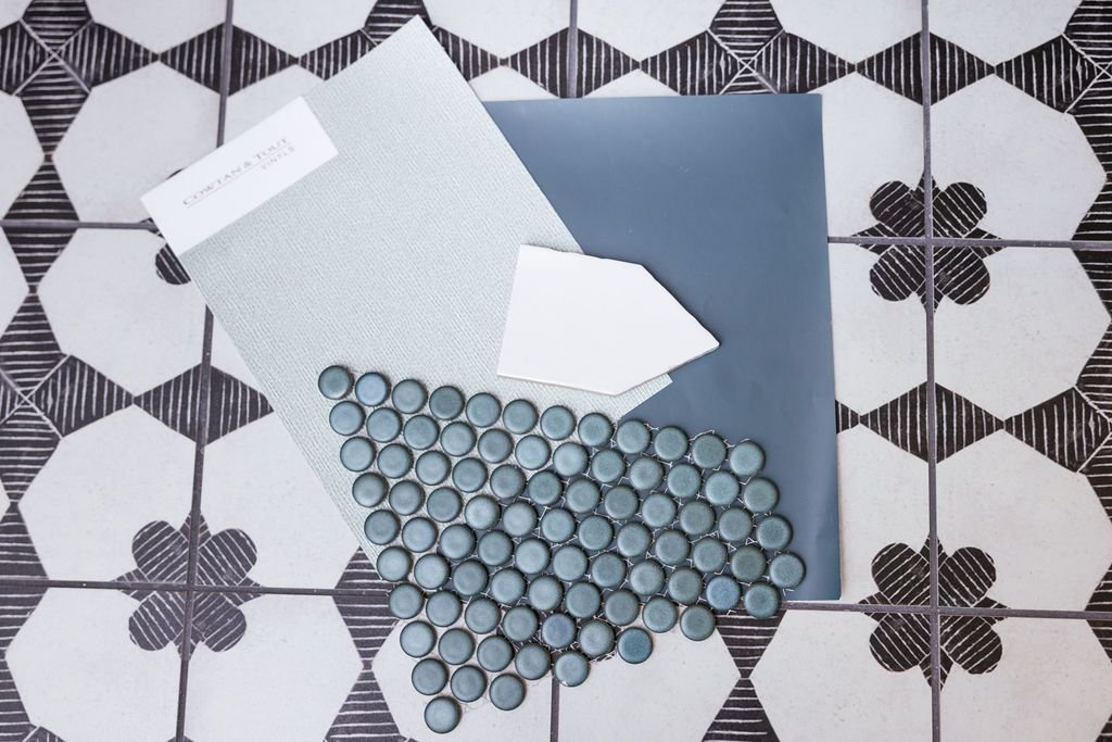
The use of mixed patterns from floor to ceiling perfectly captured our client’s eclectic style. We used a black and white geometric floral tile pattern on the floor, with white picket-shaped tile serving as a contrasting backsplash for the standalone tub and rain shower. To maximize space, we created a niche in the shower to hold toiletries, using a teal penny tile in both the niche and on the shower floor.

Varying Color

This project incorporated several bold shades – from black and white patterns to three different blues. We opted for Sherwin Williams Riverway on the walls, a beautiful slate blue shade that perfectly enhanced the teal tile in the shower. We incorporated a faint blue green textured vinyl wallpaper on the vanity wall to bring all of the hues together. 

Our clients loved the look of darker wood, which we incorporated through the vanity, shelving and matching trim. We grounded the bold look further with a beautiful gold-framed mirror and complementary light fixture on each side of the double vanity. The entire project was brought together by a stunning piece of colorful art hanging above the standalone tub, a piece that was painted by a local Nashville artist Catron Wallace. 

We’re passionate about ensuring every room in every home is thoughtfully designed with our client’s goals in mind – whether that’s a tranquil oasis of calming spa blues or a curated collection of bold colors and textures. Ready to see your dream design come to life? We’re a phone call away! 

Fun with Color in Franklin

It’s no secret, our team LOVES color! Working alongside clients who are eager to incorporate pops of color in their home are some of our favorite challenges. Through bright accent walls to textured materials and meaningful knicknacks, there are a multitude of ways to add color into home design. 

We love the way our recent Westhaven project went bold in just about every room. Check it out

The Living Room

Our Westhaven project was a new build, making the living room a literal blank canvas when we began – with only white wills, a light fixture and a traditional fireplace at its center. We maintained neutral tones through our design, while also incorporating pops of color by adding purposeful decor and furniture.

We swapped the white walls for a light blue, creating a focal point with a square-patterned wallpaper surrounding the fireplace. A pair of white credenzas were added on opposite sides, with bright decor in coastal colorways to create a contrast. With a neutral yellow rug anchoring the space, we decided to add a bold teal velvet couch, wood furniture and gold accents to complete the look. We brought it all together through a pair of fun drapes from designer Pindler & Pindler – a pattern of uneven multi-colored circles capping faux roman shades. 

The Kitchen

The living room opened into the kitchen in our Westhaven project, so we knew we needed to incorporate shared elements in both spaces. We capped the kitchen’s large windows with the same multi-colored drapes and faux roman shades, and found a complementary fabric to recover the family’s existing bar stools. The blue walls also continued into the kitchen, broken up by light gray wooden cabinets, white countertops and a white tiled backsplash. 

The Powder Room

Who knew a powder room could be this fun?! Our pops of color continued even into the half bath, with lively accent wall bookends of wallpaper dripping with color, anchored by a shiplap back wall. The art and decor brought the vision to life even further, which was completed with a translucent blue light fixture and oval gold mirror. But why stop there? We continued the fun all the way into the ceiling by adding a coat of hot pink. 

The Primary Bedroom 

We went bold in the bedroom, creating an oasis perfectly suited for restful nights with a palette inspired by the night sky. Our navy walls were brightened with white end tables and wooden and wicker furnishings, plus white bedding and lighter blue throw pillows. The result is dreamy in every sense of the word! The room’s ceiling captures the attention of all who enter, complete with a stunning Made Goods chandelier built from woven coco beads. 

Do you want to add pops of color into your space? We are experts in this area – give us a call!