August's Design Accent

Logo+-+Teal.png
Screen Shot 2020-06-29 at 11.56.31 AM.png

Hi Everyone!

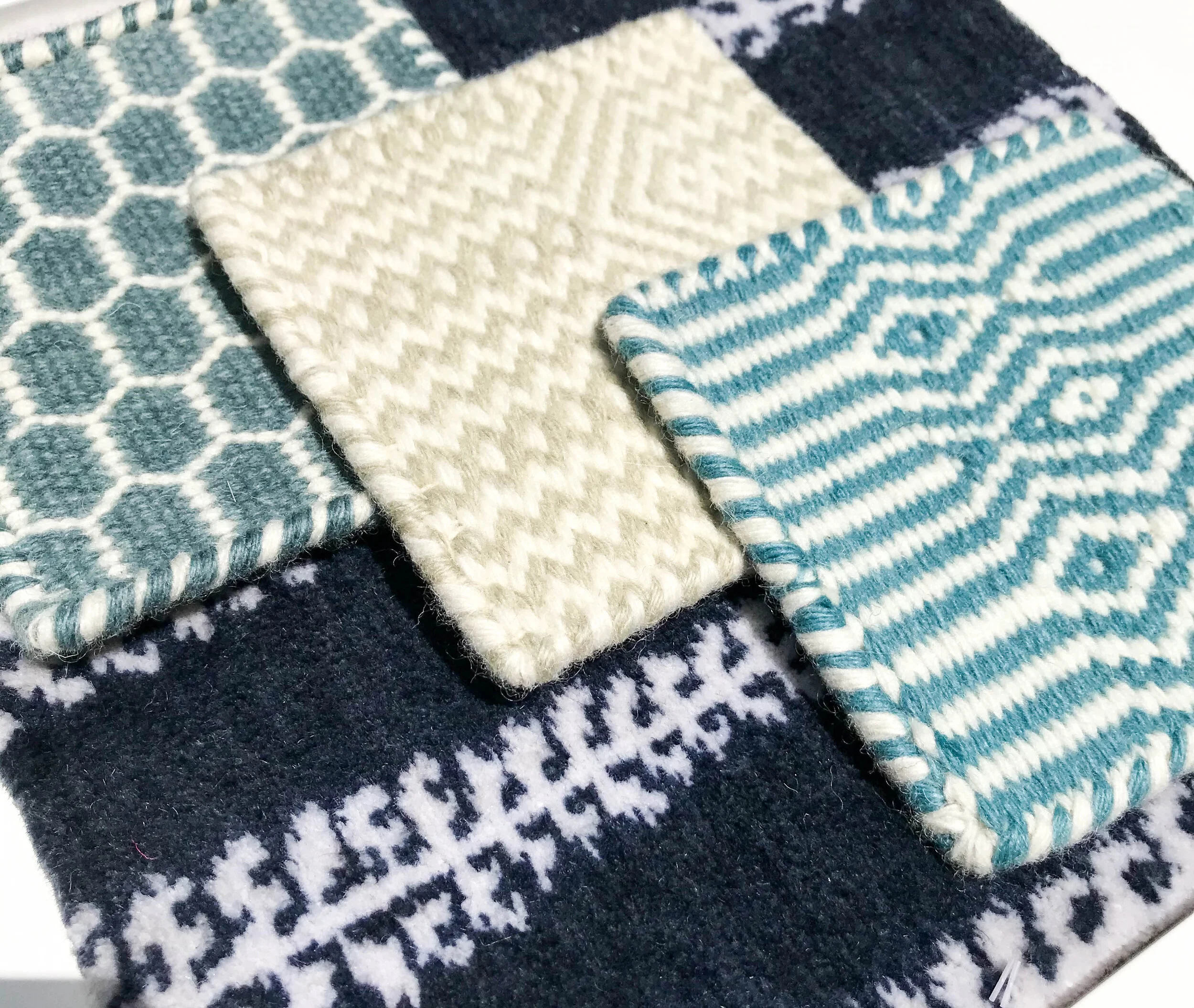
How are we all enjoying this last month of summer? We’re not sure if we expect it to cool down anytime soon. So, we’re surrounding ourselves with lots of blues and greens and cooling colors. Just like this beautiful artwork, by Jennifer Gibbs! Check out her website below, her pieces are so dreamy! And we’re honored to have a few pieces of her decorating our own office.

So, how to make art work in your space? We have a couple tips for you and some motivation, to get going in your new art searches!

Paige-Williams_Interior_Gilham-021.jpg

Grouping

When you find a piece you love, go for it! If it’s on the smaller side, look around and see if you can place it somewhere on a smaller wall. Art in the hallway, a small wall in the bathroom—it all works. When shopping for art pieces, always keep an eye out for another similar piece, to be able to group them all together and create an impact!


Paint Choice

Sometimes, a white wall is going to show off your art best! But you know that, here, at Paige Williams Interior Design, we are ALL for color. You can either match your paint color with a part of the artwork, or find a complementary color! If your art has large pops of yellow and orange, try painting your wall a light shade of blue. Imagine that the wall your hanging art on is an extension of the art piece you have.

Paige-Williams_Interior_Gilham-031.jpg

Framing

The frame is like jewelry, it’s the final touch to the outfit! When selecting framing, you can make a big impact. It doesn’t stop at only framing, but the matting of a piece too. Think of all the old photographs you have in some cardboard box in your home. Imagine taking these special pieces, matching them with a sleek or chunky frame and a big enough mat to make this small photograph, a centerpiece in your home.


Artwork reflects your personality and it can play a big part in your home, even with many pieces or quite a few. We love the conversations we have with clients who want to showpiece something special in their home!

Grand Wallpaper

Logo - Teal.png

Since this month is all about wallpaper we wanted to a highlight a special project! We made some major changes throughout the house, but installing this blue metallic wallpaper in the main room made the entire space come together. We couldn’t be more proud of the results.

_E1A1484.jpg

before…

Photo Mar 21, 9 31 49 AM.jpg

Crazy before picture, right? We could have just painted this wall but since it is such a centerpiece of the home, it called for something really special! It gives the room custom art.

Thibaut Carro.JPG

When first selecting wallpapers, we were instantly drawn to a metallic. This helped offset the dark ceilings and balanced out the bright white walls and the dark stained wood. Although there is enough light throughout the house, there’s no direct exterior windows. We felt that metallic would reflect the light and make the space glow, and it definitely did.


Interested in seeing the rest of the house? We’ve made a board to highlight all we’ve done! Check it out!


We love our clients who aren’t scared to make the commitment to wallpaper. We hope you’ll be ready to make the dive into it, yourself. We’ll keep our fingers crossed. Talk soon!
— Paige W. Design Team

July’s Design Accent

Screen_Shot_2020-02-05_at_12.57.51_PM.png

Who LOVES wallpaper!? … and if you don’t, then you should, and we hope we’re able to convince you otherwise this coming month! We understand that wallpaper has a tricky past. We too remember the formal dining rooms and kitchen borders of those cute farm scenes and plastic looking fruit. Wallpapers bad reputation means it's sometimes a hard sell to clients, but if you give it a chance, you’re going to be pleasantly surprised. We’ve listed a few guidelines that may make you feel a little better about such a great decision.

Large space, subtle pattern

If you want to cover an entire bedroom or living area, go for a wallpaper with a larger pattern. Small patterns in an open area can become too busy, repetitious and overwhelm the space. Keep it simple and classy with a wide vertical stripe, a vibrant floral or maybe a beautiful textured wallpaper.

Small space, bold pattern

Screen Shot 2020-06-17 at 1.21.14 PM.png

Use a fun and bold wallpaper on an accent wall or in a small bathroom/powder room to create visual interest and texture. Busy patterns won't overwhelm in a small space so these are the areas where you can go all out with funky designs and colors. The wallpaper Paige is holding is currently in her powder room, check out the designer below, we love her!

Go off the wall

Time to get creative. Wallpaper doesn't have to go on a whole wall. You can frame sheets in complementary colors and use as artwork. We’ve even made over dressers with wallpapered drawers. We love taking the wallpaper to the ceiling too, the forgotten fifth wall! The possibilities are endless! Especially now with all the peel & stick wallpapers available.


We’re always on the look out for new wallpaper ideas. We really think they can go EVERYWHERE. Check out some of our own inspirations!


Stay tuned for this next month, we’re loving how many wallpaper options we have now!
— Paige W. Design Team

Natural Spaces… but with PINK!

Logo - Teal.png

We have an amazing space that we wanted to share with you. This project was filled with such love and it really showcases the kindness of our client. We couldn't be more happy with the warmth and embrace this space has brought us and we’re happy to be sharing a little part of it with you!

Rogers-16.jpg
Photo Mar 29, 3 25 51 PM.jpg

Our friend, Kelly Maxwell at LittleBranch Farm, helped us with this amazing wood wall! It brings such a beautiful contrast to the ornate gold frame and helps showcase the rest of the dining room. We hear it’s been complimented many times and we can’t imagine this space without it.

Photo Mar 29, 3 11 27 PM.jpg
Photo Mar 29, 3 22 23 PM.jpg

The master bedroom is filled with pinks, white linens and warm greys. We followed the lead of the dining room and added another gold frame, some wood on the chandelier and made it cozy with the added texture of the pink fuzzy pillow and the chic whites.

Photo Mar 29, 3 09 08 PM (1).jpg
Rogers-77.jpg

See all the natural elements we incorporated into the space? Decorating with natural pieces can be a real scavenger hunt, but it really grounds the space and the rest of the home. We LOVE this antique piece and the layered photos!

Photo Mar 29, 2 50 23 PM.jpg

Check out our other projects we have uploaded to our website! You’ll find natural elements in all of them!


When we design a space for you, your personality really shines through. We see it in every project and that’s why they’re so meaningful to us! We remember all the pieces that made this space come together and you’re the biggest part of that! So thank you for trusting us and giving us the opportunity to do what we love!
— Paige W. Interior Design Team

June's Design Accent

Screen Shot 2020-02-05 at 4.20.51 PM copy.png

Hi Everyone!

This month were focusing on natural elements! We wanted to showcase some of our favorite natural products and spaces we’ve designed and can’t wait to show you more as we continue to photograph all the work we’ve done! Here are a few reasons we love to use natural elements in our design spaces, really, you can’t ever add enough!

Wools

Wool is a naturally hard-wearing product and the styles and color options are quite vast! Furniture upholsters love when we select a wool to cover a large sofa or an intricate chair, this is because it handles incredibly well, it doesn't fray or crease. Plus! it's good for the environment, its a renewable resource and biodegradable! We’re loving these wool rug samples from Nashville Rug Gallery!


IMG_5925.jpg

Sisal

image.jpg

We love using sisal because its such a great and neutral texture in a space! It adds a lot of warmth and we never have to worry about it clashing with other elements, this gives us a lot of design flexibility! Typically, we use sisal in rugs and they're perfect because they are low maintenance and great for a high traffic area, like an entryway or a hallway runner!

Check out this bedroom with the most beautiful Schumacher wallpaper!

Wood

Photo Mar 29, 3 27 05 PM.jpg

Another natural element we love working with is wood. It fits in any space-- transitional, modern, or contemporary... the list can go on! It is incredibly durable and long-lasting and has a ton of uses! We’re showcasing this beautiful project later this month but couldn’t wait to show you a little piece of it! Check out what an awesome job that our friend, Kelly Maxwell did! He is a very talented woodworker and we LOVE working with his company, Littlebranch Farm. He has helped us design some really amazing spaces (like this wood wall) and has helped us in a lot of ways—check out his gallery by clicking the button below, they are amazing designers!


By using natural elements aren’t we just trying to bring the outdoors inside? Check out some of our design inspiration with the outdoors that we love!


We hope you’ve learned a few things about the natural elements and why we love to use them! Maybe you’ll find a new appreciation for all the beauty they create, just like we did!
— Paige W. Interior Design Team